
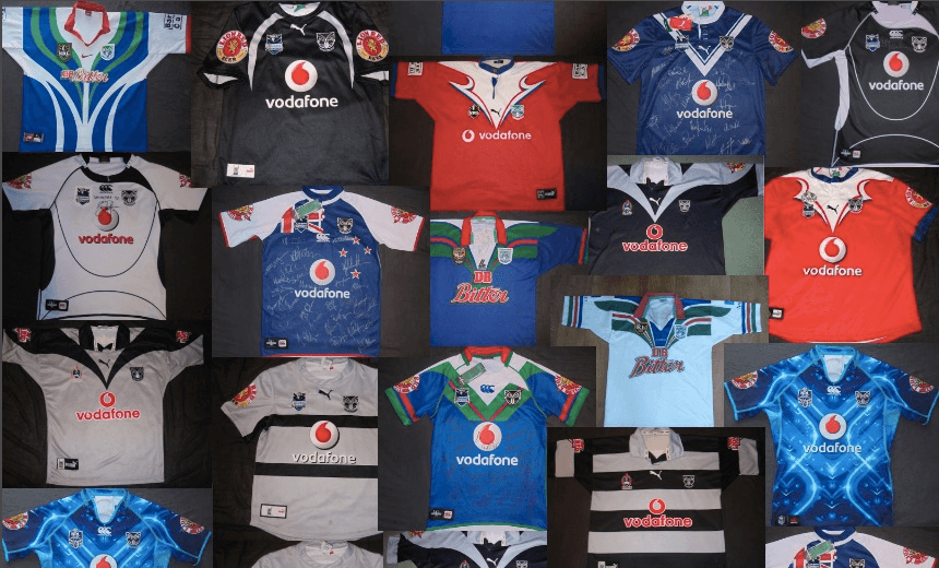


James Dann scales his personal Everest, power ranking all 45 Warriors jerseys from transcendent best to horrible worst.
The Warriors head into their 21st season tonight after a number of ups and downs. Probably more downs, to be honest. Since 1995, the Warriors have been known for their unpredictability, their thrilling highs and depressingly common lows. The same mercurial nature has applied to their many uniforms. The Auckland-based outfit have run out in more than 40 different outfits over the years, and in this article I will attempt to Power Rank all of them.
Through the dark times, Warriors faithful have kept believing. They’ve also kept buying, and so the Warriors have kept releasing. In 2013 there were seven playing strips – which would have set a truly committed fan back around $1300. Those heady days are over, with CCC now rolling out just 5, sometimes 6 shirts a year. Despite pumping out more jerseys than they do promising young backs, the club has thus far resisted the truly soul-destroying spectacle of the movie tie-in strip; let us hope that continues for as long as possible.
A few ground rules before we start – I am only including strips that the Warriors first-team have played a regular season or post-season game in. This excludes the under-20’s, NSW Cup, and any training jerseys. If there is little real variation between years, except for small changes to logo, I’ve grouped these shirts together. If I’ve missed any jerseys, then do get in touch. I’ve searched high and low for information, and am grateful for the nzwarriors.com forums, for detailed information on the different variations, as well as pictures of some of the more obscure shirts.
The Warriors have had five uniform suppliers since their inception; CCC in 1995, Lenco in 1996, Nike from 1997 to 1999, Puma from 2000 to 2008, and CCC since then.
1. 1995-96 Home

It’s hard to start anywhere else except the very beginning. This is the iconic Warriors top; the one the wore out onto the field at Mt Smart for their first match against the Broncos in 1995. Simple green and red curves on a strong blue background; a white neck with a red collar. It must have surely been a coincidence that the colours matched so well with their main sponsor, DB Bitter.
Made by CCC, it had a lot in common with the great league shirts that Canberra, Penrith, Manly and the gang wore in the 80’s and 90’s. Wear one of these to a game and you’ll have made a ton of friends before the first whistle has even blown. A reflection of it’s iconic status, this strip has been re-made 3 times, for the 10th, 15th and 20th anniversaries of the club.
2. 2001-2002 Home

After a tumultuous period, on and off the field, at the end of the 90’s, the Warriors re-emerged, now fighting for all New Zealand, not just Auckland. With them, they brought this magnificent new strip, which they wore all the way to the Grand Final in 2002. Clearly aping the black of their more successful brothers in the 15-man code, this also integrated colours from the Auckland Warriors period, in a semi-traditional rugby league V. Was the main influence for both the 2013 and 2016 Heritage shirts.
3. 2013 Wellington

I don’t know what was in the water at CCC when they were designing the 2013 shirts, but it really was a great year. This jersey was released for the Warriors’ game against the Bulldogs at the Cake Tin (which they lost, btw). It’s a nod to the Wellington league team the Orcas, with detailing that looks to the past. It’s also better than any jersey the Hurricanes have ever worn.
4. 2012-2014 Home

A very strong, simple shirt. Uncluttered, with the red and white chevrons on the front continuing to the shoulders. Again, it doesn’t hurt that the red and white fit nicely with the branding of the main sponsor.
5. 2015 Nines “Tangaroa”

The nines was introduced in 2014, and the jersey manufacturers quickly realised that it was a great chance to make a new shirt for all the super fans. While there have been a number of absolute dogs that have been presented to unfortunate teams before they run out onto Eden Park, this is one of the best. Based on the Paua shell, with blues that reference both the host city and the club’s heritage, it is one of the only shirts which competently uses Maori designs.
6. 2013 Heritage “Kete”

Looking back to the 2002 shirt, this is the Warriors’ best Heritage effort to date. Not a strict homage, the blue, white and red detailing around the neck is placed onto a textured grey body, woven like a flax kete.
7. 2010 15th Anniversary

The second re-hash of the original 1995 jersey. Very simple lines bring out the best of the striking colours. You’d hardly even notice the swoosh neck which characterised all the CCC shirts from this period.
8. 1995 Away

The 1995 home shirt, with the blue and white inverted. The club has had a number of white away strips over the years, but this is the only one that really says “Warriors”.
9. 2016 Heritage

The second attempt to recreate the 2002 jersey, though this is more traditional than 2013’s Kete. Strong lines, bold colours, but suffers from being an almost too-faithful replica of the original. This season’s strongest jersey, thus far. Fun fact: Ali Lauititi, who rejoined the club in the off-season and is technically on the player roster, was in the Grand Final team who wore the original of this 14 years ago.
10. 2003-2005 Home

On the one hand, it’s quite a plain shirt. Simple, black and grey. The only colour comes from the sponsors on the front and the arm. However, once you’ve seen what some of the designers tried to do with colour, you’ll be wishing for simple, black and grey.
11. 2013 Women in League

In 2012, the NRL introduced the Women in League round, where, to make up for the appalling record some league players have with women, they made them wear pink shirts. Because if there’s one thing we know about women, it’s that they LOVE the colour pink. You know what else they love? Flowers. This shirt manages to combine both. Aside from the tone-deaf semiotics, this is easily the best of the Warriors’ Women in League shirts. The body of the shirt has the subtle “kete” weaving pattern from the 2013 heritage jersey, and the green of the NRL badge really pops with the pink.
12. 2012 Heritage “Pounamu”

One of the first experiments with complex, patterned fabric that actually kind of works. The colour itself is nice, and the detailing, while complex, means it looks decent whether you’re watching from the sideline or the top of the East Stand.
13. 2006-2008 Away

Another pretty simple grey strip with two black hoops – a variation that Puma were pretty fond of. Nothing spectacular, but the neutrality allows the colour in the sponsors logos to pop nicely.
14. 2007 Auckland Strip

Released in 2007 for a one-off game in which the Warriors commemorated the 1977 Auckland league team, which beat Australia, Great Britain and France in the space of 20 days, at the old Carlaw Park ground. I’m always partial to a strong rugby league V, and this has got that, on top of a deep blue.
15. 2000 Away

The Warriors played away in red for the 2000 season. I don’t know why. The collar detailing looks like Puma had pioneered the page-turning animation on an iPad at least 10 years before Apple.
16. 2003-2005 Away

Most of the Puma jerseys stripped things back to basics. The grey was a good choice for an away colour, in retrospect.
17. 10th Anniversary

The first shirt to look back to the club’s history, Puma’s one attempt at the iconic 95 shirt is pretty good.
18. 2003 Special / 19. 2005 Special


I suspect that someone at the Puma factory in the mid-00’s had too many black hoops and chose to get rid of them by releasing them on special edition Warriors’ jerseys.
20. 2012-2014 Away

A white away jersey with just enough colour in the detailing to keep it interesting. This is still interesting, right?
21. 2014 Women in League

Women! Flowers! Pink stuff! Swirls!
22. 2011 Heritage

Apparently, on witnessing the Warriors’ beat the Tigers on their way to the 2011 Grand Final, a young John Key was heard to express disgust at the uniform they were wearing. When someone explained that it was the New Zealand flag, he spat out his Pinot Noir and vowed to wipe both the flag and the Warriors off the face of the map.
23. 2015 – 2016 Home

If you combine this with the previous jersey, you’ve pretty much got the Lockwood flag. And as any Red Peak fan would tell you, that is a design no-no. (Incidentally, a Red Peak-themed league jersey would almost certainly look amazing). One note: the 2016 edition does have some changes around the collar, but not enough to count as separate jerseys.
24. 2015-2016 Away

Busy up top, and simple down below. The grey panelling is a nice change from the white of the two previous away strips, and harks back to the away strips from the Puma days.
24. 2002 Mt Albert strip

Worn specially for a game at Carlaw Park against the Rabbitohs, these are a very rare and sought after shirt. Helen Clark has one! But that doesn’t mean it’s good. It kind of doesn’t know whether it’s blue hoops on a yellow jersey, or a yellow V on a blue jersey.
26. 2014 Nines / 27. 2014 Eden Park


Two very similar shirts from the same year – the Nines jersey has white under the arms, and white piping, whilst the Eden Park edition has blue under arms and piping. It’s like the Tiki from the Warriors logo is trapped in the Matrix. An early attempt at cashing in on the Space Maori movement.
27. 2009 Heritage

Similar to the 2007 Auckland shirt by Puma, except less good. They’ve half committed to the chevron, and it doesn’t work. Plus, the dumb CCC neck swirl (more on that later).
29. 2006-2008 Home

By the end of their relationship with the Warriors, it looked like Puma had really run out of ideas. While most of their shirts are pretty minimalist, this is taking it too far. You’ve done well to get this far. We’re two thirds of the way through, and while the jersey’s are only going to get worse, I’d urge you to keep reading, otherwise I’ve spent hours and hours trawling through the darker parts of google image search for nothing. FOR NOTHING.
30. 2008 Heritage

To celebrate 100 years of the Australian Rugby League, all clubs had a heritage jersey in 2008. Puma chose to look back to the weird away strip they did just 8 years before. Even though it’s not that different, it still manages to be much worse. The neck and shoulders are shapeless, and the double badges on the left are an unfortunate mess.
31. 2009-2011 Home

CCC took back the jersey-making reigns in 2009, a completely different company to the one that made the 1995 shirts. CCC were in a very curvy period at the time. There is the unnecessary swirl around the collar that doesn’t add anything. There are also the two white lines that cut up the main body of the shirt. When wearing the full strip, the team looked like pandas, or perhaps, given the way they played in 2011, more like orca.
32. 2011 Eden Park

Never one to turn down the opportunity to release a new jersey, the Eden Park jersey in 2011 was produced to celebrate the fact that the Warriors were going to play a couple of games at the home of rugby. And because rugby, they made an all black jersey! But by the time you had added in all their sponsors and badges, they became a very messy black and white that only served to reinforce how well the ABs have done to keep the sponsorship on their shirts to a minimum for so long.
33. 2006 Awen Guttenbiel testimonial / 34. 2010 Heritage


A very special jersey for the Awen Guttenbiel testimonial in 2006, with a custom moko pattern. CCC remade a version of it in 2010, that is pretty much, but not exactly, the same. The grey away jersey’s of the mid-00’s work because they are nice and simple, something which this is not.
35. 2014 Heritage

The third time the original jersey has been re-hashed, and the least successful. The body contains the names of all the players who have worn the Warriors shirt, but that’s surely not enough reason to buy another shirt.
36. 2009-2011 Away

Even though this was the shirt worn in the team’s most recent Grand Final appearance, that doesn’t mean it’s good. The weird black lines across the midriff serve no purpose apart from drawing attention to the girth of one’s beer belly.
37. 2015 ‘Te Maumaharatanga’ (The Memorial) ANZAC jersey

The Warriors’ worst attempt at patriotism since the 2011 heritage jersey, and at least that one had an element of simplicity on it’s side. This one has everything; a New Zealand flag, an Australian flag, white crosses, Kiwis, all lovingly rendered in fake-stained glass. However, it could have been worse – much, much worse.
38. 2015 Women In League

While I’ve complained about the other Women In League shirts, at least they were trying. I’m not sure what this is meant to say. Women like fibre-optic communication? Fingers crossed that in 2016 they can come up with something a little more meaningful than this.
39. 2015 Heritage “Te Whare Tu Toa”

I’d guess that it’s an attempt to recreate some of the magic of the 2012 Pounamu jersey, but lightning does not strike twice here. The front is too busy, with the traditional Maori tukutuku panel being graced by a warrior with a ball. The back was even worse, with a name board featuring the name of each and every Warrior to have played thus far. It was too much information. Plus, it was brown. Brown.
40. 1997-1998 Home and Away

In 1997, the club jumped to the Superleague. All the teams had jerseys with the same design, but with different colours. The Warriors’ one integrated more white into the traditional blue strip, with green around the neck and a red collar. At the end of the Superleague Wars, the Warriors came back into the NRL, but for some reason, they brought this awful jersey with them for the 98 season.
41. 1997 Superleague Special

A mysterious and very hard to find jersey used for one game in the 97 Superleague season against Canterbury. Blue – and not a particularly nice blue – with a red collar. Best forgotten.
42. 2012 Women In League

This was the Warriors’ first Women In League shirt, and it’s their worst (to date). To raise the issue of domestic violence, the team ran around with a shirt that depicted people getting shot with a gun. But pink!
43. 1999 Home and Away

Instead of throwing away the awful jersey inherited from the Superleague, they decided to try and work with it, and somehow made it even worse. More white, less blue. More curves, less that says “league”. This was the first year that Vodafone was a sponsor.
44. 2016 Nines “Spirit of the Warrior”

The Warriors delivered their best performance at this year’s Nines, as beaten finalists. Unfortunately, they did it in their worst Nines jersey. Just because you can print detailed drawings onto a shirt doesn’t mean you should. Just like the hastily-recruited sponsor for the event, this was a real Downer.
45. 2000 Home, 2001-2002 Away

Please have mercy on my soul.