


The New Zealand Olympic team uniforms were unveiled earlier this week, and the sight of them sent Robyn Gallagher into a long spiral of sadness. She explains her profoundly negative reaction.
Every four years the New Zealand Olympic team unveils their uniform, usually a combination of black and fern motifs, and you look at it and think, “Oh, that’s quite nice”.
Sometimes the formal wear for the opening ceremony might look a bit weird or too fashion-ey, but there’s usually nothing terrible going on, and when New Zealand walks in between the Netherlands and Nicaragua, we can feel all proud and patriotic about our team in black.
But this year’s designs are different. They’re so plain, so ordinary looking, a cure for insomnia in clothing form. It’s exactly the sort of gear you would have passed over 10 years ago in the bargain bin at Rebel Sport, rejecting it for looking too boring.

That’s fine if you’re going to the gym or having a game of social netball, but when it’s an international sporting event that will be viewed by hundreds of millions of people, wouldn’t it be nice to have our athletes in quality athletic gear that that represents New Zealand style in 2016 and will make those gold medals shine brighter? (Yes, it would.)
Let’s examine the athletic invisibility cloak that is the 2016 New Zealand Olympic uniform in this Spinoff photo essay.
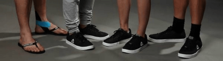
If there’s any time when black sneakers have the potential for being cool, it’s right now with the health goth trend for black athletic gear (seriously). Instead New Zealand has gone for these really cheap looking sneakers. It’s like they harnessed the essence of sadness and fashioned it into a shoe.
And those the jandals look embarrassed to be jandals. If you’re going to wear jandals in Rio, they’re going to be compared with the iconic Havaianas, with their colours and curves. But these don’t even come close, with thin straps that have “NEW ZEALAND” embossed on them, looking like a something found in a souvenir shop next to the fluffy sheep keyrings and paua shell ashtrays.

Want to get the look of an NZ Olympic team member? Just rummage around the forgotten gym bag stored in the back of your car. It’s regulation black made even more boring by adding dramatic slashes of light blue and lime green, like the ghost of late ‘90s sportswear was trying to claw its way out. It’s so ordinary looking that if I saw someone dressed like these guys, hanging around a starting line, I’d assume it was a competition winner, having their dream come true by meeting their favourite Olympic stars.

I’m actually ok with the athletic gear being a bit plain, but it really surprises me that the opening ceremony suits also lack style. Just plain black suits with white shirts, like a couple of newly promoted call centre supervisors who are making an attempt to look managerial.

Compare and contrast with 2012, when New Zealand was sporting these fierce Rodd & Gunn-designed blazers with white piping, taking a cue from the uniform of New Zealand’s team in 1948. And look – they broke up the monotony of black with shades of grey. See, that’s not hard.
But if you really want to be reminded of what a terrible missed opportunity this has been, just take a look at the uniforms from other countries. They do what New Zealand usually does – team up with established fashion and sportswear designers.
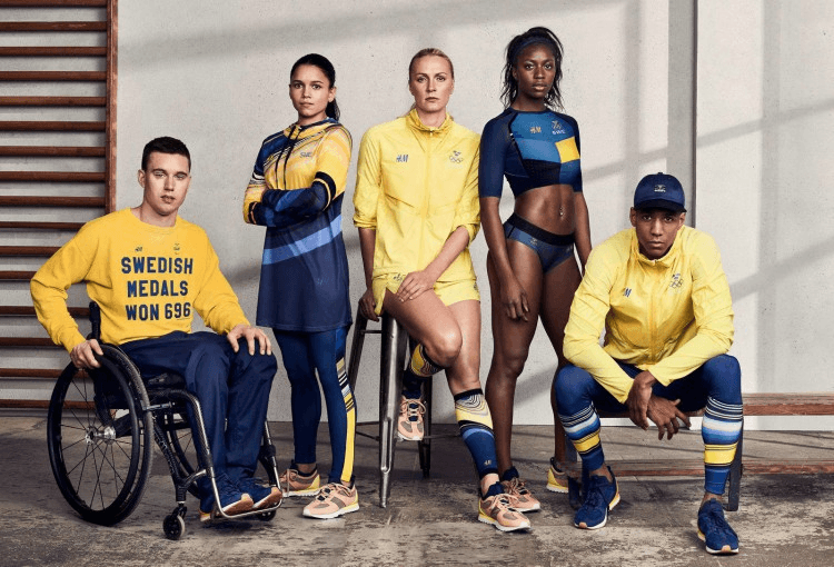
Sweden’s uniform is designed by mass market fashion retailer H&M. Just look at that sweatshirt, though. Why can’t we have one that says “NEW ZEALAND MEDALS WON 103”? (Ok, not quite as impressive, but then Sweden are counting the Winter Olympics which doesn’t actually count.)

Of course Canada have a cool uniform, and they all look so happy and Canadian. The athletic gear was designed by Hudson Bay Company, while the opening ceremony suit (happy hipster, front row, third from left) is by Dsquared2. Though I can see how New Zealanders would be deeply suspicious of all this brightness and cheer.
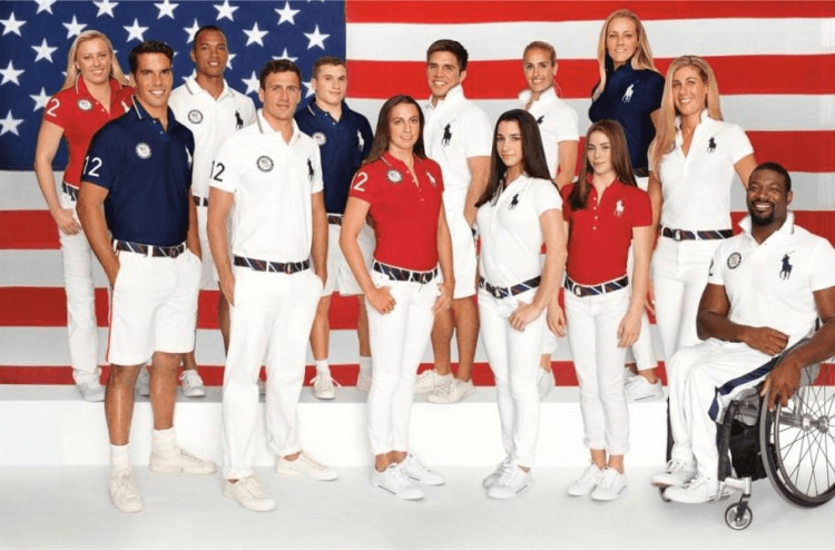
Ralph Lauren decked out Team USA in his Polo range, looking all red, white and/or blue. New Zealand could take this route – we also have red, white and blue in our flag. But posing the athletes in front of a giant New Zealand flag would just be embarrassing and awkward for all involved as true New Zealanders.
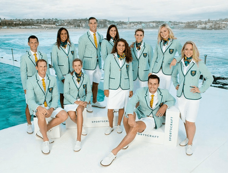
The Australian opening ceremony suits are designed by Sportscraft. And zika-carrying mosquitos be damned – Australia knows that a hot country requires shorts, After all, Australia is the nation that invented aerosol mosquito repellant.
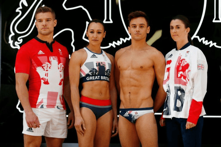
Great Britain’s uniforms were designed by Stella McCartney (daughter of Sir Paul) in conjunction with Adidias. She’s been praised for her boldly patriotic designs, and it’s nice to see that she was kind enough to use a few tiny leftover scraps of fabric to fashion some swimwear for diver Tom Daley.
But then maybe our plain t-shirts and shorts are actually representative of New Zealand. Maybe as a very humble, modest and egalitarian nation, we would feel extremely awkward seeing our athletes looking sharp and standing out in bold, stylish designs. Maybe we like the idea of them looking like ordinary people just coming from the gym, and not as the elite athletes they really are. Keep the dream alive – if you grab that plain blue t-shirt and grey shorts and keep up your thrice weekly cardio, one day Olympic glory could be yours.