The Peach Teats billboard is a legitimate cult classic. In the first of a new series uncovering the stories behind classic New Zealand illustrations, Toby Morris meets the artist responsible for State Highway 1’s favourite cheeky calf.
If you’ve ever driven State Highway 1 through the central North Island, you’ll have seen it. And if you’ve seen it, you’ll remember it: two punchy words and an illustration of a sly and some might say flirty calf, a beacon of strangeness in the rolling farmland. It’s the Peach Teats sign, midway between Hunterville and Mangaweka, a cult classic billboard that’s been catching eyes and confusing tourists for 25 years.
But while everyone knows the image, few probably think about the story behind it. For illustrators, that’s a familiar situation. It’s a funny job like that – one that sits midway between commerce and art. On one hand you’re a tradesperson taking briefs, solving business problems, working within the space a job gives you, but on the other hand you need to be an artist too. You need creativity, style, a vision. But artists get their name on the plaque. Movies have credits. We know who sings our favourite songs. Illustrations can have an enormous impact, emotionally, culturally and financially, but usually their creators remain invisible. But not today: this article is the first in a short series looking at the stories and the artists behind some of our most enduring images.
And what better place to start than the beloved Peach Teats logo? For 25 years this masterpiece has forced a smile out of thousands of speeding New Zealanders and become an icon that’s inspired hundreds of road trip photos (#peachteats for life), spawned both official and bootleg t-shirt ranges and even been the subject of a country blues song telling the thankfully fictional story of the sign being stolen (“Peach teats, Peach Teats, what’ll I do?/ It just ain’t a road trip if I don’t see you”). The actual teats themselves have done well too: from a small shed on the farm where the billboard lives they grew in just a few years into New Zealand’s biggest selling calf feeding teat. These days they’re sold all around the world, and everywhere the product goes, that cheeky smiling calf is right there with it.

“We just wanted to make an impact with the product. Teats have never really been taken seriously before we came along, and no teat was ever recognisable.” says Robert McIntyre, founder of Peach Teats. “We wanted a fun sort of thing – make it enjoyable rearing calves, which traditionally it’s never really been”.
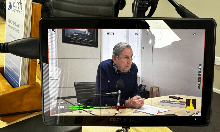
And so, early on, Robert decided he needed an illustration for the logo to give the product a friendly face. He asked around in Palmerston North, and everyone he asked recommended the same person: it had to be Murray Lock.

Murray had been a newspaper cartoonist in his teens, before going into business as Murray Lock Graphics in Palmerston North in 1979. In the early days he did syndicated cartoons and illustrations for magazine and newspaper advertising. “Going back a bit, every image appearing in ads in newspapers was basically illustrated – you couldn’t print photographs all that well” he tells me. “In fact for about seven years I think all I did full-time was illustrations of products for supermarkets. All of Watties, all of Campbells, all that sort of stuff – anything that’d go in the supermarket, I did a drawing of it.”
Later on he moved into graphic design, creating hundreds of logos for contractors, commercial property agents, fruit and vegetable growers and every other kind of business in the region. By the time Robert knocked on his door in 1993 illustration work was getting scarcer, but when he got the chance to draw he was a master of his craft, if a humble one. When we chat he casually reveals that he was actually responsible for not one but two of the central North Island’s most enduring images: Murray also drew the bulls in the Bulls signs. Const-a-bull, recycle-a-bull, delect-a-bull, you know the ones. Groan at the dad jokes all you like, but all these years later they’re still using Murray’s illustrations, even if they’ve been copied so many times they’ve started to become warped.

“I think he might have seen those Bulls signs – he said we could do something a bit like that but a bit more friendly,” says Murray, thinking back to Robert’s original brief. “He wanted something cartoony. Calf feeding is a fairly mundane thing, so he just wanted to put a bit more fun into it.”
So Murray got to work, and it wasn’t long before he had something that hit the right tone: friendly but cheeky, not too serious but not too silly either.
“It was just done on pen and paper. I only did maybe two or three and then I did a quick marker sketch once I got it right and he basically went with it. I think it turned out more humorous than he probably originally intended, but he was really happy with it”.
So happy, in fact, that Robert couldn’t wait to start using it. Unbeknownst to Murray, Peach Teats started using the marker sketch straight away, without waiting for Murray to make a cleaned up final version. “Basically he started to use that and then when he came back and told me I said ‘you’ve got to let me clean it up a little’ and then that’s pretty much exactly as it’s been.”

Once he had a finished version Robert wanted to invest in showing it off. Part of his family farm ran alongside the country’s busiest road and he figured, correctly it turns out, that a billboard would have a big impact. “It’s like a lot of things – it shouldn’t be there, you know what I mean? No one expects a billboard to be like that.
“I remember when I got the billboard made I wanted it the same size as a liquor billboard. It’s very hard to get big billboards like that made in country areas”.
And from there, with Murray’s illustration front and centre of everything they did, the company took off. And while people might laugh at the logo, behind the joke there’s a masterful piece of branding and business strategy: Peach Teats redefined a product.
“In teats for calf feeding, before he came along no-one actually even had a name for the teat,” says Murray. “If you bought a teat from one of the farm supply stores you asked for a code number. You know, I want a 128C or something – they don’t even have names. So he kinda revolutionised the whole product.”
And while Murray gives credit to Robert for the concept and the quality of the product, Peach Teat’s success is also proof of the power of a good illustration. Used well, illustrations can bring a face and a personality to a brand or a product, conjuring up a tangible image from thin air that sticks in people’s minds and creates emotional connections. We like that calf, so we like the brand. I don’t care about soft serve ice creams, but Frostee Boy seems like a cool guy. The Four Square Man is a trusted old mate.
Murray isn’t drawing so much these days and sometimes he worries that illustration is a dying trade, but the work he has done is as effective as ever. I asked Robert about the value Murray’s drawing bought to his business and he smiles. “Oh enormous. With that logo, and the name that’s easy to remember, in countries like Ireland – if you ask people to name a teat, probably the only teat they can name would be Peach Teats. It’s just had such an impact, you know. We’re very lucky. It’s quite unique, that drawing of Murray’s. I actually feel sorry for him – I get all the compliments and I never did it.”