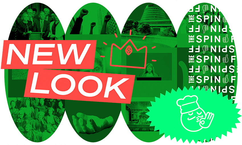


The Spinoff’s creative director Toby Morris explains our new site, new app, new look and the evolution of our design philosophy.
So, you might have noticed The Spinoff site is looking more than a little different today. We have new colours, a new layout, new fonts, a new approach to imagery and an evolved logo, all the result of a long project that we’re excited to finally share with you.
I’m a big believer that what you say is important, but how you say it is too. Design sets a tone and sends a message – which at worst screams “we don’t really care”.
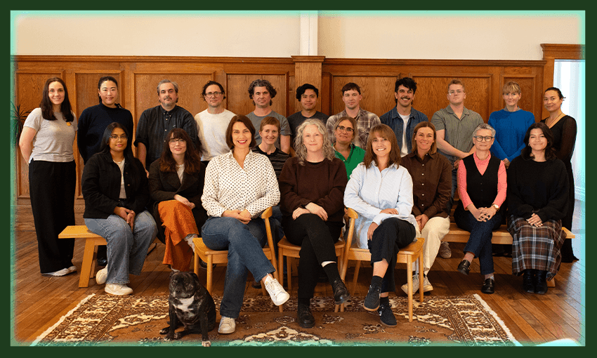
At The Spinoff, we care. I feel lucky to work somewhere that values the importance of communicating visually. Our editorial designer Tina Tiller has a unique style and her voice is allowed to shine. We run comics, data visualisations, animated science explainers, and work with a wide range of illustrators. Today we take the next step with this new design. We want to keep evolving and growing – showing you who we are not just in our stories but in how we present them.

It’s been two-and-a-half years since we started talking to Auckland design team Studio Akin about a new look and a new site. We needed to evolve how we presented ourselves, and the first step in doing that is figuring out your voice – who you are, who you aren’t. To me, The Spinoff is about the mix of high and low, of serious and silly. We run detailed articles by academics about legal ramifications of law changes alongside the funniest, silliest, most heart warming recaps of reality TV. We interview the country’s leaders at the same time as ranking the country’s chip flavours.
So, we moved towards colour and personality, an eclectic mix of styles, and the radical idea that maybe every image doesn’t have to be a rectangle. We wanted to keep the things that feel uniquely us – like Tina’s distinctive design energy and sense of humour, and make it feel like we’re growing up a little, getting a little sharper.

From there we took Studio Akin’s vision and worked with Translate Digital to build it into a reality. The Spinoff is a huge platform with a lot of moving parts, and it’s one thing to get it looking pretty, another task entirely to make it all work seamlessly. You’ll see on the right of our desktop site, for example, a new and easier way to navigate the latest live updates, and within stories a much improved ability to find related stories.
You’re now never too far from jumping into the latest news, or browsing our most popular content. Videos and podcasts have become a much bigger part of what we do since the last site was built, so we’ve drastically improved how you can explore those too. Huge thanks to Translate, and to Elisa Rivera who has run the project from our side, for making it all work. (Fingers crossed, let us know if you spot any of the inevitable early bugs).
One of the most visible elements: we have a new, evolved logo! Like kids at Christmas peeking at the presents, we couldn’t wait – over the last few months we’ve been slipping it into a few things already and no one seems to have freaked out. It’s not radically different from Joel Kefali’s original, or Simon Chesterman’s evolution – just a bit smarter, a bit sleeker. Check out the merch store for some new mugs and pencils with the new logo on them if you’re the type of person who likes to express their cultural affiliations through merch (I get you.)

Probably most importantly for your reading experience, we have new fonts. Kris Sowersby from Klim Type Foundry is a New Zealander creating absolute world-class gold-standard typefaces, and we’re so happy to be able to use such perfect Kiwi-made fonts on the site. We’ve made the body copy of articles bigger, cleaner and clearer, and we love having the beautiful serif Domaine pop up around the site in moments of contrast.

We also have a brand new set of custom emojis to use in our imagery. Some are universal, some are very specific to us: in our office a crab means “ooooh/yes/tell me more” and a snake means “naaaah/nope/ew” so you’ll find crabs and snakes in there. You’ll also find our beloved office dogs, Mad Chapman’s iconic cup microphone, a super shaka, a big yikes, a sad cowboy, and several variations on a world on fire, a dumpster fire and a rubbish bin on fire. It’s like a 2021 time capsule.

Then, to connect all that together, we have a new approach to the images we make to go along with stories. Lots of bold colours, new frames and strong shapes. Like a chef with a new menu, it’s going to be fun to see what comes out as we start to use this.
So, it’s all new and exciting, and we hope you like it. No doubt something we haven’t thought of will pop up and we’ll be tweaking as we go – it’s a big site – but our newish CTO Ben Gracewood will be working alongside the Translate team to iron out any kinks.
Lastly – some thanks. Huge cheers to Studio Akin for the original vision, and Translate Digital for bringing that vision to life. Thanks to Tina Tiller whose energy and style has informed the look and feel of The Spinoff like no one else, Duncan Greive for recognising the value in investing in design, Eli for keeping the whole project on track and to all the editors and writers who’ve tirelessly tested and tweaked and fed back on a million little details. And Daylight Creative, our content studio, for coming in late and hot to help shape the copy and design of some of the key furniture.
It’s great to finally be able to share it with you. We hope you love it as much as we do.