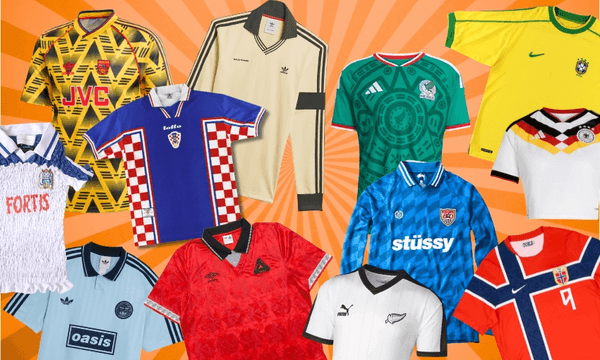
Someone had to do it.
In 2015, around the time of the World Cup, the New Zealand Cricket Museum started selling this stunningly attractive poster. Designed by Into the White Press, it details the evolution of the New Zealand one day international cricket uniform, from its beige beginnings to years of glorious grey, the teal dawn of the new millennium and beyond. It documents the best of times and the worst of times – probably no other major New Zealand sports team has worn such a weirdly diverse range of colours and designs.
It is this poster that has provided the basis for these definitive and final rankings of all the New Zealand ODI cricket shirts. Here they are, listed from best to worst. (Some of the more similar designs have been consolidated into a single entry. These rankings may not reflect the official views of the New Zealand Cricket Museum or any other museum.)

1. 1992 World Cup
Sorry if this is too predictable. These weren’t just good cricket uniforms, they were some of the best uniforms in any sport ever. You could take a shirt from any of the eight countries that participated in the 1992 Cricket World Cup and put it in a museum and it would sit comfortably alongside a ’90s Chicago Bulls singlet and the Brazil soccer jersey as examples of flawless sports uniform design.
Strongest memory: The opening match against Australia at Eden Park. Crowe’s majestic century; Harris’ freakish throw to run out David Boon; a majestic diving caught & bowled by Rod Latham.
2. 1993-1994 B&H Series
The lightning bolt shirts worn by New Zealand, Australia and South Africa in the ‘93-94 Benson & Hedges tri-series are by far the coolest cricket shirts of all time. Everybody who wore one looked cool. There’s a reason Chris Pringle wears it on the cover of his autobiography Save the Last Ball for Me.
Strongest memory: This sensational “cowboy act” from Richard de Groen; later in the same game, Mark Greatbatch absolutely going off at the umpire after taking a screamer off a no ball.

3. 1993-1994
A surprisingly modernist shirt design which the passage of time has revealed to have been a masterpiece. It’s the first time a significant amount of black was seen on a New Zealand cricket shirt, while the red, white and black striped flourish was never seen before or since. Who knows what it signified, but it was a stroke of genius.
Strongest memory: Danny Morrison took a hat trick against India at McLean Park in this shirt, which ranks second only to the memory of Jeff Wilson batting New Zealand to victory over Australia in Hamilton – his greatest moment in international cricket.
4. 1990
Simple, elegant, this was the first truly great New Zealand one day cricket uniform. A darker shade of grey sets this design apart from anything before or since. Imagine if all the other grey uniforms had been this shade.
Strongest memory: Shane Thomson being the coolest Young Gun (not sure why).

5. 1991-1992
New Zealand cricket shirts have flirted with elements of baseball design a couple of times over the years, and the lettering on display here is by far the most successful execution. It makes the shirt, and every other element pulls its weight in support. Perfect design.
Strongest memory: Chris Pringle’s sensational 50th over maiden to Bruce Reid.
6. 1985-1988
The one significant change to the classic beige uniform removed the dark brown side panels and replaced them with a smart brown stripe across the torso. While the nostalgia is understandably directed toward the original beige shirt, this one is objectively better.
Strongest memory: Dipak Patel’s one-handed boundary catch.
7. 1997-2000
The infamous teal shocked cricket fans to their core when it was unveiled in 1997. Only now, two decades on, is it starting receive the recognition it deserves as one of the iconic New Zealand cricket shirts. It is the design favoured by flag-waving Sky Sports background pest Sonny Shaw, which will likely tarnish its image forever, but the time has come to show the teal its due respect.
Strongest memory: Cairns, Astle, Fleming and McMillan all enjoyed some of their finest moments in this shirt, but the most powerful single memory it evokes is the time Adam Parore was given out hit wicket after a Brett Lee bouncer knocked his helmet onto the stumps.
8. 1997-1998 Carlton & United Series
A slightly darker shade of teal – sometimes also known as turquoise – appeared on this vertically-striped shirt from the Australian summer of 97-98. On reevaluation this was a good shirt, very underrated.
Strongest memory: When Dion Nash came a centimetre from pulling off one of the great run chases.
9. 1989
For one short summer between beige and grey, New Zealand played in white shirts with a thick black band around the torso and three thinner black vertical stripes running down to the waist on one side. Weird… but kind of good?
Strongest memory: The power and the fury of a young Danny Morrison.
10. 1996 World Cup
A remix of the 1992 World Cup concept, inferior to the original but underrated nonetheless. The colours seem kind of washed out, but could just be the poor picture quality broadcast out of the subcontinent. Also loses marks for the abysmal abbreviation ‘N. ZEALAND’.
Strongest memory: Pure bewilderment at the news Chris Harris had scored 130 against Australia.
11. 1995
The Centenary season shirts were influenced by the 1992 World Cup designs, swapping out the uniform shoulder stripes for each team’s national flag. On the field things couldn’t have been more different to ’92, though, and New Zealand’s horrible run of form inevitably harms this shirt’s nostalgia value.
Strongest memory: Justin Vaughan playing for New Zealand.
12. 1997 Independence Cup
Grey with a black collar, and the curious design detail of having every other Independence Cup team’s crest patterned on the front. Surprisingly tidy, and a hint of the direction the New Zealand shirt could have gone in were it not for the teal revolution.
Strongest memory: None, but it looks like Sachin Tendulkar gave Andrew Penn a hell of a flogging.
13. 2014-2015
Just imagine how good this design would look if it was simple clean lines of black and blue instead of looking like the cover of a Telecom investment prospectus. It’s still one of the better modern designs, and New Zealand’s dream run in the 2015 World Cup certainly doesn’t do its nostalgia value any harm.
Strongest memory: A smorgasbord of cricket delight: Guptill’s double-century, the Williamson six, the Elliott six, Vettori’s catch, Southee demolishing England…
14. 2016-
Here we are in the present day, in simple black with unobtrusive white trim. This is the middle of the road – it’s entirely acceptable when you consider the designs still to come on this list, but pretty dull and unambitious compared to those that come before it.
Strongest memory: These are the golden years of Colin de Grandhomme.

15. 2013-2014
The colour blue is introduced to the New Zealand cricket shirt. Why not? An unwritten law around this time seems to have declared all sports uniforms must include ‘graphics’. Generally speaking this has been a very bad development, but the 3D koru design here could be a lot worse.
Strongest memory: Kane Williamson, and the unfamiliar feeling of total confidence in a New Zealand batsman at the crease.

16. 2001-2007
If the 2000s are one big blur in your cricket-watching memory, manufacturer WStar may be to blame – from 2001-2007 the Blackcaps kit barely changed. They quickly ditched the teal and settled on a black (sometimes with a bit of dark grey) design, one which looks good on paper but always looked kind of bad in real life. There’s a reason you rarely see a fan wearing one these days.
Strongest memory: Shane Bond performed some of the greatest feats of fast bowling this country has ever seen while wearing this shirt. But for some reason the strongest memory it evokes is of Andre Adams taking 1-45 off 8 overs.
17. 1994 Mandela Trophy
Worn on the infamous tour of South Africa when some players smoked a marijuana cigarette during a team barbecue, or braai. Who could blame them? The almost Comic Sans typeface is somehow the best thing about this design.
Strongest memory: None. The Mandela Trophy was a quad-series which also involved South Africa, Sri Lanka and Pakistan. New Zealand didn’t win a single match.
18. 1980-1984
New Zealand’s classic beige uniform has gone on to achieve cult status for a reason, and that reason is that it was incredibly bad. It deserves to be remembered with fondness, but come on. Look at it.
Strongest memory: What else could it be?
19. 1996
This baseball-inspired pinstripe design marked the end of the road for New Zealand’s grey uniform days. It incorporated elements from many of the previous designs and added up to less than the sum of its parts. To be fair, not quite as bad as the baseball-inspired Shell Cup uniforms of the same era (including the season of Cricket Max they played in shorts).
Strongest memory: Lee Germon as New Zealand captain. Craig Spearman opening the batting. Gavin Larsen our best player. An overwhelming feeling of hopelessness and despair.
20. 1994 Wills World Series
The shirt fronts in this tri-series between hosts India, West Indies and New Zealand reversed each team’s primary and secondary colours. For New Zealand, that meant black shirt fronts with silver detailing, years before that would become the norm. This is a weird one.
Strongest memory: None. New Zealand failed to win a match in the series.
21. 2009
Canterbury regained the Blackcaps contract in 2009, finally freeing New Zealand cricket fans from an eternity of the same WStar uniform by replacing it with something even worse. They did get rid of the massive floppy collars and tidied up the cut, but they also made the players look like they were cosplaying a bad DOS computer game.
Strongest memory: Look at this shirt for a few seconds, then close your eyes and think of a New Zealand cricketer. Who do you see? It’s Kyle Mills.

22. 2010-2012
A simplification of the 2009 shirt which did away with the superhero chest detail. In theory that should only make it better, but the result was somehow even worse. A bleak and unattractive uniform.
Strongest memory: The man, the legend, Scott ‘Miley’ Styris going toe to toe with Mitchell Johnson.
23. 1999 World Cup
There can be such a thing as too much teal. All the other New Zealand uniforms of this era balanced it out with plenty of black, but the 1999 World Cup design went all in. When taken in the wider World Cup uniform design context it makes sense, but… no. This is the worst.
Strongest memory: Geoff Allott briefly, unexpectedly, becoming the best swing bowler in the world.