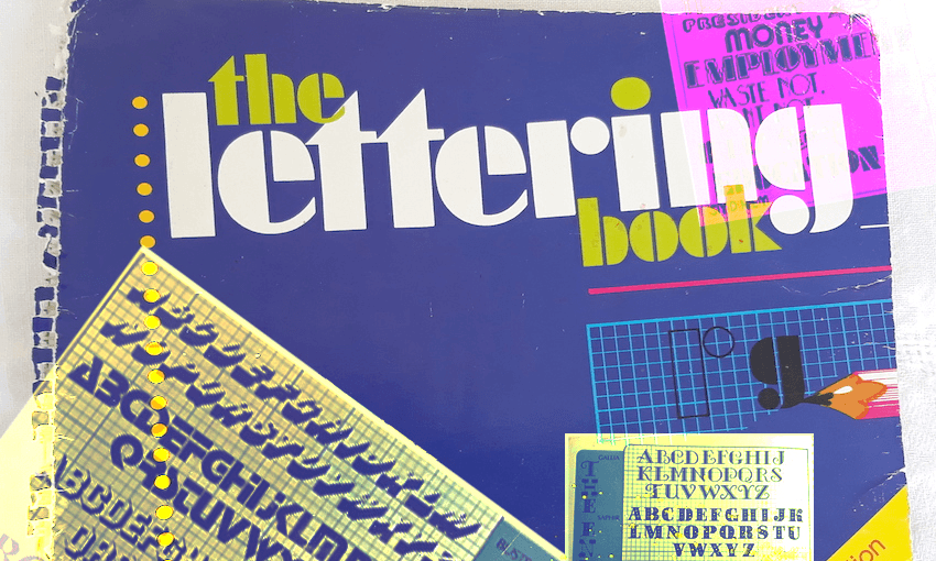
Tara Ward remembers the book that made every school project sing.
If you went school in New Zealand during the ‘80s and ‘90s, there’s one book you’ll remember. The deep blue cover will be etched into your memory, the hand sketched drawings seared onto your emotional core. It was The Lettering Book, a wondrous volume of letters and numbers printed in different styles and fonts, and the only thing you needed to make your school work sing. It was a kid’s best friend in a world where Comic Sans was but a glint in Microsoft’s eye, and ‘cut and paste’ was something you did with scissors and glue. True story.
Written by Noelene Morris and first published by Scholastic Australia in 1982, The Lettering Book provided creative inspiration for every school project, title page, topic book and poster. Whatever you were drawing, even if it was just your name, you used The Lettering Book. If you were lucky you had your own copy, or you’d have to beg, borrow and steal someone else’s, because it was never checked in at the library. The Lettering Book was more valuable than gold. It was better than 12c biscuits from the school canteen, and I ate a lot of 12c Chocoade biscuits from the school canteen.
Hundreds of years and thousands of Chocoades later, The Lettering Book‘s iconic cover still evokes an immediate reaction from those who loved it. I posted an Instagram story about a lovely time at the beach that all my mates ignored, but when I put up a photo of The Lettering Book, a sudden landslide of nostalgia slid into my DMs. “Flashback!” they screamed. “My favourite book ever!” one cried. “I went to school with a girl who knew all the fonts by heart and would shout at you when you did the tails on your y’s and g’s wrong,” said another. I’ll never go to the beach again.
Yet for a book so treasured by so many, The Lettering Book only has a four star rating on Good Reads. This is obviously a travesty. One reader gave it a single star (a plague on both their houses), and I can only suggest they take a long hard look at themselves, preferably in a mirror bordered with a jazzy zigzag frame, with ‘explain yourself’ etched into the glass in Uptight Neon font.
No doubt Toby Morris would rate The Lettering Book five stars, because the award-winning illustrator and writer credits the book with changing his life. “The Lettering Book was a bible for me,” Toby says. “I got it when I was about 8 or 9 at Hampton Hill Primary in Tawa, like pretty much every kid in my class. I started off tracing some of the cool bubble lettering for projects, then I started to go from tracing to making up my own cool lettering, and realising that this was something I enjoyed and was kind of maybe good at.
“It’s hard to describe that realisation, but that book opened up this big door for me that design was a thing.”
It was a thing, alright. A beautiful, life-altering thing, because no matter how crap your school work was, The Lettering Book lifted it up. It was our saviour and we were all Josh Groban singing ‘You Raise Me Up’ to it, in a world where Josh Groban was only about ten minutes old. I could stand on mountains thanks to The Lettering Book, making fancy headings for a project about mountains, trying to distract from the fact I didn’t give a shit about mountains. School was my Everest and The Lettering Book was my Sherpa, and I’ll be damned if together we didn’t knock the bastard off.
The Lettering Book introduced us to a world of style and grace. It showed us how to space words properly and how to draw a 3D shadow effect, a skill that should go straight to your CV. We traced the fancy letters by holding the page against the window to catch the light, but the best bits were the random words hand-drawn in wacky styles, like ‘employment’ and ‘war!’ and ‘our feathered friends’. Now all you needed was a project about birds with a job who were sent into battle, and you had that Form 2 Social Studies gold star in the bag.
The book was filled with exotic fonts like ‘Frankfurter Highlight’ and ‘Lubalin Demi Bold’, styles belonging to weird and wonderful worlds. Script was the perfect font to write the invitations for your upcoming wedding to your Year 7 boyfriend. Microgramma Bold Extended took up a lot of space, saving you from filling up the rest of your project with actual facts. If you used Old English you were both a calligrapher and a genius, and Calligraphic always looked better once you’d doused it with a wet teabag and burned the edges like the shipwrecked pirate you were born to be.
Because that’s what The Lettering Book did best of all: it inspired a generation of Kiwi kids to become whatever they wanted to be. It’s amazing how many of us, regardless of the different schools we went to, stared at those blue and white pages and dreamed big, Helvetica Outline-sized, dreams. The Lettering Book will always have my heart. Five stars, would read again.

