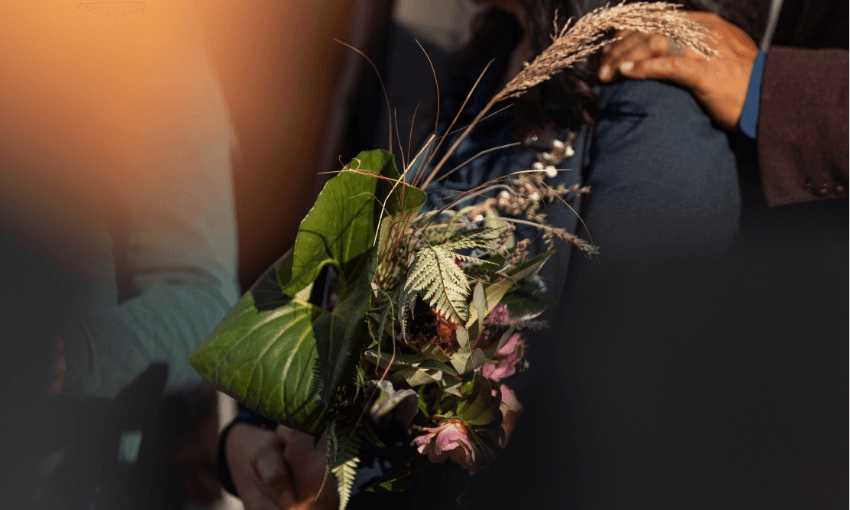

Artist and curator Tyson Campbell introduces some of the covers on display as part of the Objectspace exhibition Pohewa Pāhewa: Te Rūma.

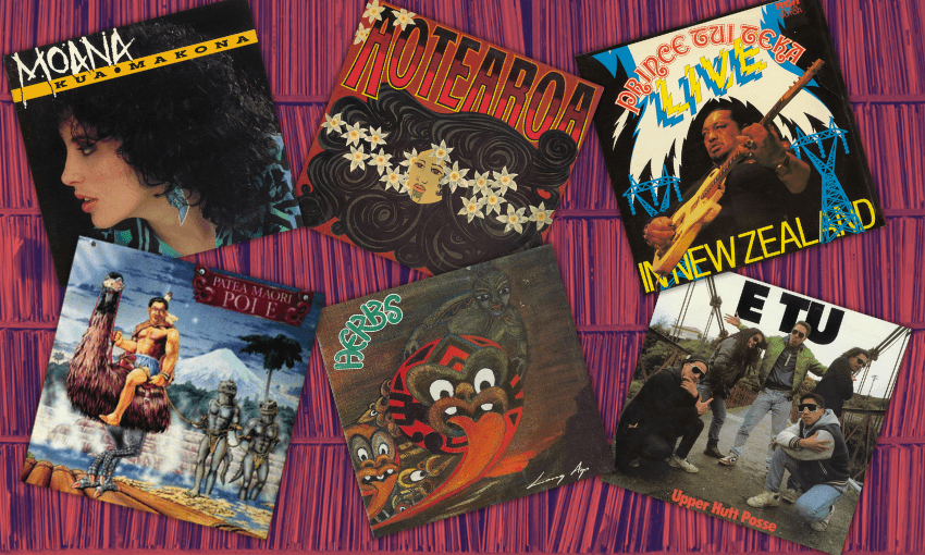
Herbs – Long Ago (1984, Warrior Records)
Artwork: Norman Te Whata & Emily Karaka; Design: Richard Collins
The Long Ago cover doesn’t just sell a record – it visually encodes the politics of early 1980s Aotearoa: Land Back, language revival, Indigenous pride, and solidarity. It’s an album sleeve that could sit alongside a protest banner at Waitangi, a kōhanga reo mural, or a poster from the Springbok Tour marches – because in that moment, music, art, and politics weren’t separate worlds. The warm ochre tones paired with the figures suggest joy, movement, and futurity; the perfect blend of “reggae principles”.

Prince Tui Teka – Live in New Zealand (1982, RCA Limited)
Design: Unknown
Prince Tui Teka on this cover is giving peak male diva energy – but in a very specific Aotearoa showband style: cheeky, self-aware, focused and “no f@!ks given”. There is no visual subtlety in this cover. Tui Teka’s presence in this album is high-voltage, the backdrop of electricity pylons supercharge the sky – bringing the music and the people closer to the gods. The overall energy gives maximalist, chaos-agent: where uncle is being uncle.

Tiki Taane – Past, Present, Future (2007, Dirty Dub)
Designer: Ryan Marx; Photographer: Greg Riwai; Subject: Tiki Taane & Uekaha Taane-Tinorau
This striking album cover is serious. The tūpuna are present; utmost respect is demanded, and the eyes of the central figure act as portals into higher realms of being. The choice of monochrome removes the distraction of colour, giving the image a timeless, archival quality – almost like a treasured 19th-century photograph, but with a modern photographic clarity. The typography is minimal and unobtrusive, letting the portrait carry the full emotional weight. This album cover could also double as a highly prized taonga for an intimate and sacred space.

Nick Nicholson & The Neketini Brass – Exciting Brass (1968, His Master’s Voice (N.Z.) Ltd)
Design: Unknown
The burnt-terracotta orange, often used between 1968-75, brings a “funkalicious-adjacent” tone to the album cover. The analog-collage approach of screen printing the tiki and trumpet offers a more vintage, humble and “frank” contribution to visual culture of late 60s Aotearoa. The warmth of the album cover is gentle on the eyes, but perhaps a little forgettable. It is hard not to judge a book by its cover these days, but I would say that it is a jazz banger, particularly for those who enjoy the intellectualisation of listening to improvisational music, rather than discussing the PR management of the band.

Anna Coddington – Te Whakamiha (2024, Loop Records)
Artwork: Te Kahureremoa Taumata; Photography: Holly Burgess
The background explodes with psychedelic, swirling hues of blue, black, white and orange. Within these swirls are repeated motifs: stylised eyes peering from multiple directions, koru-inspired curves, and wave-like forms suggestive of water and movement. The horizontal mirroring suggests a Rorschach organic form – perhaps a way of leaving the viewer room to interpret the abstraction as they feel? The central figure is confident, assertive, poised and graceful. This album cover feels very summery. Looking at it, I can almost smell the sunscreen and saltwater of a quintessential beach holiday.

Kiri Te Kanawa & The St. Mary’s Choral Group – Kiri Te Kanawa with the St. Mary’s Choral Group (1970, His Master’s Voice (N.Z.) Ltd)
Design: B. Patrick Connell; Photography: courtesy of NZ Women’s Weekly
The overall tone of the album cover is soft, elegant, and feminine. The pastel pink, flesh tones, and black background offer a classic portrait of 70’s beauty; seductive, light and buoyant. The interlocked hands, showcasing her rings, demonstrate the taste of the time; chunky, sharp-lined modernism met with delicate mid-century pearl insets. Overall, the album cover suggests a casual, understated glamour – hair in perfect form, natural makeup, and confident effervescence.

Mark Williams – Mark Williams (1974, EMI)
Design: Kevin Dunkley; Photography: Michael Baigent
This album cover balances intimacy, stardom and simplicity. The glamorous, chrome-style typography elevates Williams into an International context; there’s no hint of Kiwiana in this cover. The warm-toned, direct portrait emphasises his sensitivity, his gaze suggesting he is listening to your every word. It embodies 1970s aesthetics – kitsch, sensuality, and stylised authenticity – all working to frame him as both a heartthrob, a skuxx-deluxe and “gender bender”. Side note, the cover also reminds me of the Woodland Goddess portrait by J.H. Lynch, a sultry mainstay in pseudo 70s interiors across the motu.

New Zealand Maori Theatre Trust World Tour Company – Aotearoa (1970, Kiwi Records)
Design: David A. Cowe
This cover screams oldie but goodie – an object handed down through the family, part painting and part record. The warm earthy tones and curly black hair suggest a cultural pride distinctive of a 1970s bi-cultural bohemian aesthetic. The swirling hair evokes ripples in water, bubbling mud, or even the takarangi spiral, a circular form found in Māori carving styles.

Gerry Merito – I Must Have Been A Beautiful (Baby) Spaceman (1966, Impact Records)
Photography: Alan Fox
The cover presents itself as playful, chaotic, and deliberately tongue-in-cheek, underscored by a strong kitsch sensibility. The palette of oranges, browns, whites, and electric blue establishes a visual balance between the graphic design, props, and photographic staging. Yet the art direction remains ambiguous, if not provocative – bordering on what might now be considered “cancellable”. One reading could situate the imagery as a commentary on the temperamental outbursts often associated with masculinity and diva-like performance. More broadly, the cover encapsulates the spirit of its era: irreverent, humorous, and resistant to solemnity.

The Mauri-ora Maori Jet Set – The Mauri-ora Maori Air New Zealand’s Jet Set (1965, Hei Tiki Records)
Design: Unknown
While celebratory in tone, this cover also reflects tensions of representation: Māori identity presented for mass consumption, framed as entertainment for the tourist gaze. The joyous imagery is genuine, but the stylisation and marketing gloss suggest a curated performance of “Māoriness” designed to fit an exportable, Air New Zealand-friendly image. From today’s perspective, the cover is both nostalgic and problematic. It encapsulates a moment of cultural vitality and Māori visibility on the world stage, but it also shows how Indigenous culture was commodified in service of national branding and global spectacle. The psychedelic visual feel perhaps can “spin” the audience out over this political, and common, tension.

Pātea Maori Club – Poi E (1984, Maui Records)
Artwork: Joe Wylie
An iconic and timeless album cover – untouchable, in a league of its own. The artist’s hand is unmistakable here: a hand-drawn illustration that fuses science fiction and surrealism into something fantastical, casually camp, and unapologetically Māori. It collapses history, myth, and fantasy into an image that is at once absurd, powerful, and unforgettable. Like the music itself, the cover resists assimilation, offering instead a proudly local, inventive, and playful vision of identity.

Aotearoa – Maranga Ake Ai (1985, Jayrem Records)
Design: M.A. Kopua & N.M.P. Tupara
Another hand-made drawing, depicting courage and strength. Heroism is evident here, smashing through the cement ceiling of the colonial world (maybe?), the self-reveal and statement that Māori will not be hidden is articulated through this energetic cover. The black and white colouring also provides clear contrast, allowing the typography to be part of the overall image, rather than over it.

Hannah Tatana – Maori (1966, Viking Records)
Artwork: E. Mervyn Taylor
The simplicity of this album cover is both tasteful and timeless. The earthy browns lend warmth and depth, grounding the image. Minimalist linework traces the face with elegance, a gesture that complements the weight of the typography. Together, these elements achieve a quiet balance. A subtle splash of white in the top left corner introduces contrast, guiding the eye without distraction. Nothing here competes for attention – each detail sits in harmony, allowing the cover to speak with clarity and poise.

Waitangirua School Polynesian Club – Waiata Ano (1979, Sonic)
Design: Lorna Kramer with Mark Hansard
The red, white and black of this album cover recall the colours of tino tangatiratanga, carrying connotations of sovereignty and strength. At its centre, the red figure is ambiguous – part human body, part defensive armour – its sharp edges hinting at combat and resistance. The composition falls into three distinct sections: the flowing kowhaiwhai pattern, the central figure, and the hibiscus with tropical foliage. Together, these elements signal not only a grounding in Aotearoa, but also a wider connection across Te Moana-nui-a-Kiwa. Perhaps less moving parts, and more visual cohesion would make this album cover stronger.

Aotearoa – e Hine/Positive (1986, Jayrem Records)
Design: Mark Kopua
The overall image carries a washed-out, Billabong-style surf aesthetic. The central circular shape anchors the composition, drawing most of the visual focus. Paired with the koru waves, the tino rangatiratanga flag border, and bold typography, it achieves a strong graphic quality. However, the placement of the words “positive” and “e hine” feels slightly distracting, pulling attention away from the balance of the circular form.

Mokotron – The United Tribes of Bass (2024, Sunreturn)
Artwork: Huriana Kopeke-Te Aho
The overall impression of this album cover is one of balanced maximalism. Every element works in harmony – the border and central figure creating a perfectly framed depth. The interplay of lighter and bolder lines generates contrast and rhythm, elevating the composition into a striking piece of visual art. At the centre, the Māori–robot figure embodies a sci-fi indigenous futurism, yet remains firmly grounded in Mātauranga Māori. It is both futuristic and ancestral, technological and unapologetically Māori. The result is a cultural statement, framing The United Tribes of Bass as a rallying call, asserting the identity, unity, and imaginative power of indigeneity. The designer’s skill is not only impeccable but visionary – this cover truly is the moment.

Alien Weaponry – Tangaroa (2021, Napalm Records)
Design: Indium Design & Barny Bewick
Perhaps taking inspiration from the iconic Swiss artist H.R. Giger, this album has a dark, scary and alien characteristic. The reds and blacks swirl into the magenta-aquatic gradient found in sea creatures. The composition is circular and claustrophobic, suggesting entrapment, confrontation, or a spiralling pull into another realm. This album cover is intense, posed with slippery movement – the animal stares down at you, will you fight or flight?

Six60 – Six60 (2015, Massive Entertainment & Universal Music NZ)
Artwork: Michael Parekōwhai
The cover reads as playful yet serious, like a coded cultural statement on technology; sound bars and TV test patterns. It is maximalist in its colour choices but minimal in form. It resists easy interpretation, instead acting as a visual equaliser – flattening different colours into a shared rhythmic structure. This suggests the music might be layered, multi-vocal, and designed to challenge as much as it entertains. While the design is colourful and vibrant, it is, unfortunately, forgettable.

Patea Maori Club – Aku Raukura (1987, Maui Records)
Artwork: Joe Wylie
This psychedelic cover is another great edition to Pātea Māori Club’s visual language of indigenous futurism. The striking tropical colours blend customary and futuristic symbolism, the tekoteko being fished up by a warrior steering a techno-submarine-waka. This image conjures pride, resistance and strength, inspiring that both the past, present and future can co-exist at once

Upper Hutt Posse – E Tū (1988, Jayrem Records)
Photography: Kenneth Downie
This cover is giving “boys will be boys!” This nostalgic photograph feels like a summary of a unique relationship held by five musicians who partied, lived and created together, as well as an image Upper Hutt youthfulness in the 90s. The album covers bold font type, matched with this hood photographic feel, asserts a self-made-for-the-culture attitude.

Moana – Kua Makona (1986, Maui Records)
Art direction & styling: Margaret Purkis; Design: Dunk; Photography: Brendon Harrison & ZOOM Creative
Now this is a glamorous photographic album cover depicting a 90s starlet in her full fashion glory. The typography and image work in harmony, bringing a kind of punk-grunge aesthetic to the feel of the album. The yellow, aquatic blues, flesh tones and darkness speak to a 90s attitude. Most of the visual information leans towards the left side of the album, but balance is held through the shadows of the hair. Again, another diva moment in Māori music history.

Various – Waiata Anthems (2019, Universal Music NZ)
Design: Kauri Hawkins
The bold, curvilinear design, inspired by kōwhaiwhai, suggests the face of a tiki and imbues the cover with mauri. Smaller arrowheads echo the central form, channelling energy downward and guiding the eye toward the restrained typography of Waiata Anthems. Complex yet sleek, the design weaves the colours of tino tangatiratanga into a high-vibration graphic. The result is an emblem of Māori pride and sovereignty in the now.

Various – Heed the Call! Whakarongo, Ngā Tamariki! (2017, Vostok)
Art Direction: John Baker; Design: Barny Bewick
This cover gives off the charge of queer photography, even if it doesn’t formally sit within that category. The candid monochrome image is both glamorous and intimate, offering a backstage glimpse into the shimmer and radiance of Aotearoa’s soul and funk underground of the 70s and early 80s. Its grainy texture amplifies the raw energy of live performance, while the bold pink circle disrupts the black-and-white palette with funk, playfulness, and urgency. Together, they create a dynamic and well-balanced cover that distils the spirit of the era.

Teeks – Something to feel (2021, Sony Music)
Design: Indium Design; Photography: Francis Carter
A high-quality monochromatic photograph, the image exudes intimacy and quiet sensuality. The water droplets trace the body like rain, evoking a cleansing, almost ritualistic atmosphere. With the subject’s back turned, there is a sense of concealment and privacy, as though the viewer is granted only a fleeting, vulnerable glimpse. The absence of any text or artist name becomes its own statement – an enigmatic gesture that lets the image speak for itself, a true if you know, you know cover.

TrinityRoots – True (2002, TrinityRoots)
Art and design: Turi Park; Photography: Dean Zilwood
Overall, the mood is earthy, ethereal, and sublime. The tā moko-like patterns seem to echo the flow of all living things, weaving body and environment into one rhythm. The central figure almost forms a river, cascading down from the maunga at the heart of the image. The warm sepia tones, the haze, and the organic bursts of light settle across the cover like shifting breath, inviting the viewer to surrender to the entanglement of line, body, and place within te ao Māori.

Marlon Williams – Te Whare Tīwekaweka (2025, Universal Music NZ)
Artwork: Jennifer Rendall; Design: Sebi White
The cover features a haunting charcoal drawing of a man in a top hat entering a ghostly house, lending an eerie and spectral quality to the album’s presence. The handwritten font, paired with the sketch gifts a sense of introspection, as though pulled from the pages of a private journal. The image feels coded and enigmatic, inviting the viewer to unravel the relationship between the cover and the music within – settle in for some storytelling.

Ria Hall – Manawa Wera (2020, Loop Records)
Artwork: Robyn Kahukiwa
An illustration by the late Robyn Kahukiwa powerfully contains Ria Hall’s iconic music. Two fierce women stand in union, embodying strength and solidarity. The album title Manawa Wera – a heated heart – is vividly evoked through the use of red, while motifs of bloodlines, connection, motherhood, and cosmology pulse through the image. The bold palette of red, black, and white asserts both tino rangatiratanga and mana wāhinetanga, making this album cover not only a visual companion to the music but also a treasured artwork in its own right; a reminder of collective action, whakapapa, and interconnection.
Pohewa Pāhewa: Te Rūma runs from 6 September to 2 November 2025 at Objectspace in Auckland. Curated by Zoe Black with tautoko from Desna Whaanga-Schollum, Tyrone Ohia, Graham Tipene and Johnson Witehira.